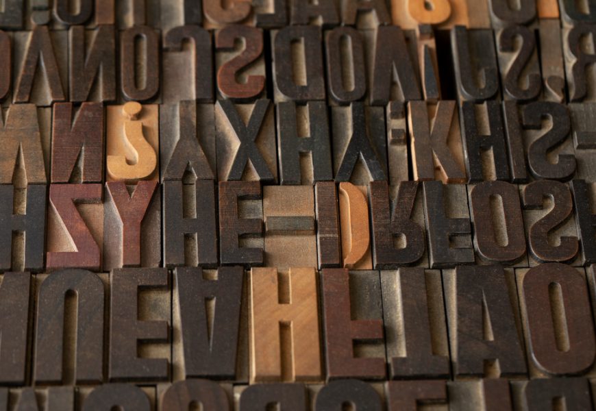
Typography might seem like a technical afterthought in blogging—a matter of choosing “something that looks nice” from a drop-down list of fonts. But in reality, the typefaces a blogger selects hold profound influence over how their content is received, experienced, and remembered. Fonts are emotional instruments, shaping everything from tone and credibility to accessibility and even the speed at which readers absorb ideas. In the crowded world of digital content, where thousands of new posts emerge each minute, typography becomes a quiet but powerful differentiator that gives a blog its unique voice and character.
This article explores typography’s role in digital writing through four critical dimensions: its psychological influence, its intersection of readability and accessibility with personality, its role in building a distinctive narrative voice, and its future in a technologically evolving online culture.
Understanding the Psychological Influence of Typography in Digital Writing
Typography is far more than surface-level decoration. The fonts displayed on a blog actively influence how readers emotionally react to what they are reading. Serif fonts, for instance, are often associated with tradition, credibility, and intellectual seriousness, while sans serif fonts tend to project modernity, clarity, and minimalist openness. Handwritten or script fonts can suggest informality, warmth, or artistic flair. In each case, the font is not simply carrying words—it is lending them emotional weight.
Readers may not consciously analyze these typographic signals, yet they respond to them nonetheless. A dense, tightly spaced paragraph in a stark typeface can make content feel heavy, authoritative, or even intimidating. Conversely, generous spacing with a clean, rounded typeface might lighten the mood, making the post appear approachable and conversational. Typography, therefore, guides not just what readers think but how they feel while engaging with content.
Moreover, typography subtly controls pacing. Bold headlines divide attention into chunks, italics can whisper emphasis, and line length adjustments can make scanning easier or harder. When carefully chosen, fonts create a rhythm that leads readers effortlessly through the text, sustaining engagement and encouraging them to finish a post rather than abandon it halfway. In a digital climate where trust is precious and fleeting, typography effectively acts as an invisible contract between blogger and reader—promising clarity, approachability, and professionalism all at once.
Exploring the Relationship Between Readability, Accessibility, and Character Expression in Blog Typography
While psychological influence shapes perception, the functional qualities of typography—chiefly readability and accessibility—play an equally vital role. A blog might have stunning prose, but if the font is too small, too ornate, or poorly adapted for mobile screens, the content immediately loses potency.
Readability is more than simple legibility; it’s about delivering comfort. Bloggers today must make typographic decisions with diverse audiences in mind: some readers will scroll on smartphones, others on large monitors; some may have visual impairments or dyslexia. Fonts that are clear, well-spaced, and resistant to strain allow content to be accessible to the widest range of readers. For example, sans serif fonts like Arial or Open Sans often excel in digital contexts for their crisp display, while typefaces designed specifically for accessibility—like Atkinson Hyperlegible—can support readers with low vision.
At the same time, functionality does not cancel out personality. Fonts embody a sense of style and, by extension, the blogger’s identity. Selecting fonts that reflect the blog’s thematic voice—whether playful, professional, experimental, or academic—ensures that typography feels authentic rather than sterile. The challenge lies in balancing form and function: using typography that resonates emotionally but also respects inclusivity, ensuring every reader has equal comfort and comprehension. This delicate tension reveals typography not only as a creative decision but as an ethical responsibility of any conscientious online writer.
The Role of Font Pairing, Hierarchy, and Layout in Building a Blog’s Unique Voice
Typography becomes most expressive when fonts are treated relationally. That is, when different typefaces and styles are combined, paced, and layered within the text, they work together to form a rhythm and hierarchy—somewhat like characters in a play.
Headings, for example, typically demand boldness and distinction to draw readers into sections, while body text is expected to remain comfortable and neutral for sustained reading. Captions, block quotes, callouts, and menus each perform their own functional roles, and selecting complementary fonts ensures these elements collaborate rather than compete. A mismatched pairing, such as an elaborate cursive headline sitting atop a severely geometric body text, can jar the reader and dilute authority. Conversely, a thoughtful combination creates a seamless narrative flow.
Hierarchy and layout also set priorities: large, high-contrast headlines declare “pay attention here,” while subtler subheadings guide readers gently through secondary layers of meaning. Line spacing, margin decisions, and the balance of white space frame the reading experience like stage lighting—often unnoticed, but always shaping the story. Through these cumulative design choices, typography grants blogs a recognizable, memorable identity, turning them from generic online text into a distinct voice that carries trust and personality.
Anticipating Future Shifts in Blog Typography and Its Cultural Meaning
The landscape of blog typography is not static—it is continually evolving alongside digital technology. Responsive design, now a baseline expectation, ensures text adjusts to screen size and resolution. Yet new technologies, such as variable fonts, allow unprecedented flexibility. A single typeface file can now contain multiple weights, widths, and styles, enabling smoother adaptation across platforms while also reducing loading times. This evolution makes typography more versatile and sustainable for bloggers managing diverse readership experiences.
Artificial intelligence is also beginning to play a role in shaping typographic personalization. AI-driven design tools may soon help bloggers adjust fonts automatically based on reader preferences—perhaps enlarging type for those who linger or offering alternative font styles to fit neurodiverse processing needs. The personalization of typography could turn blogs into more immersive, reader-sensitive environments, enhancing not only readability but also emotional connection.
Yet, amid all technological innovation, one constant remains: the human resonance of fonts. Typography is one of the rare design elements that invisibly carries cultural memory, emotional connotation, and narrative tone in equal measure. As blogs evolve into more immersive storytelling platforms, fonts will continue to act as their emotional signature—at once functional, aesthetic, and profoundly human.
Typography in blogs is often overlooked, but it is central to shaping content style and character. It influences how readers feel, how comfortably they engage, and how deeply they connect with the narrative voice. From psychological impact and ethical accessibility to font pairing strategies and future innovations, typography anchors the relationship between blogger and audience. Ultimately, fonts are not just design choices; they are storytelling tools that give digital writing its personality, trustworthiness, and staying power in a fast-moving online world.